How The Project Started
When I originally started creating these posters it was just a way for me to warm up before I got into my actual design projects for the day. I was struggling to get back into the flow of work after Christmas so I decided that I would start each day by completing one simple poster. It was already halfway through January at this point and I was hoping the sense of achievement would motivate me and give me energy for the rest of my work. I set myself half an hour every day and stuck to it. It worked. I looked forward to making them and I was happy to post them on social media when they were done.
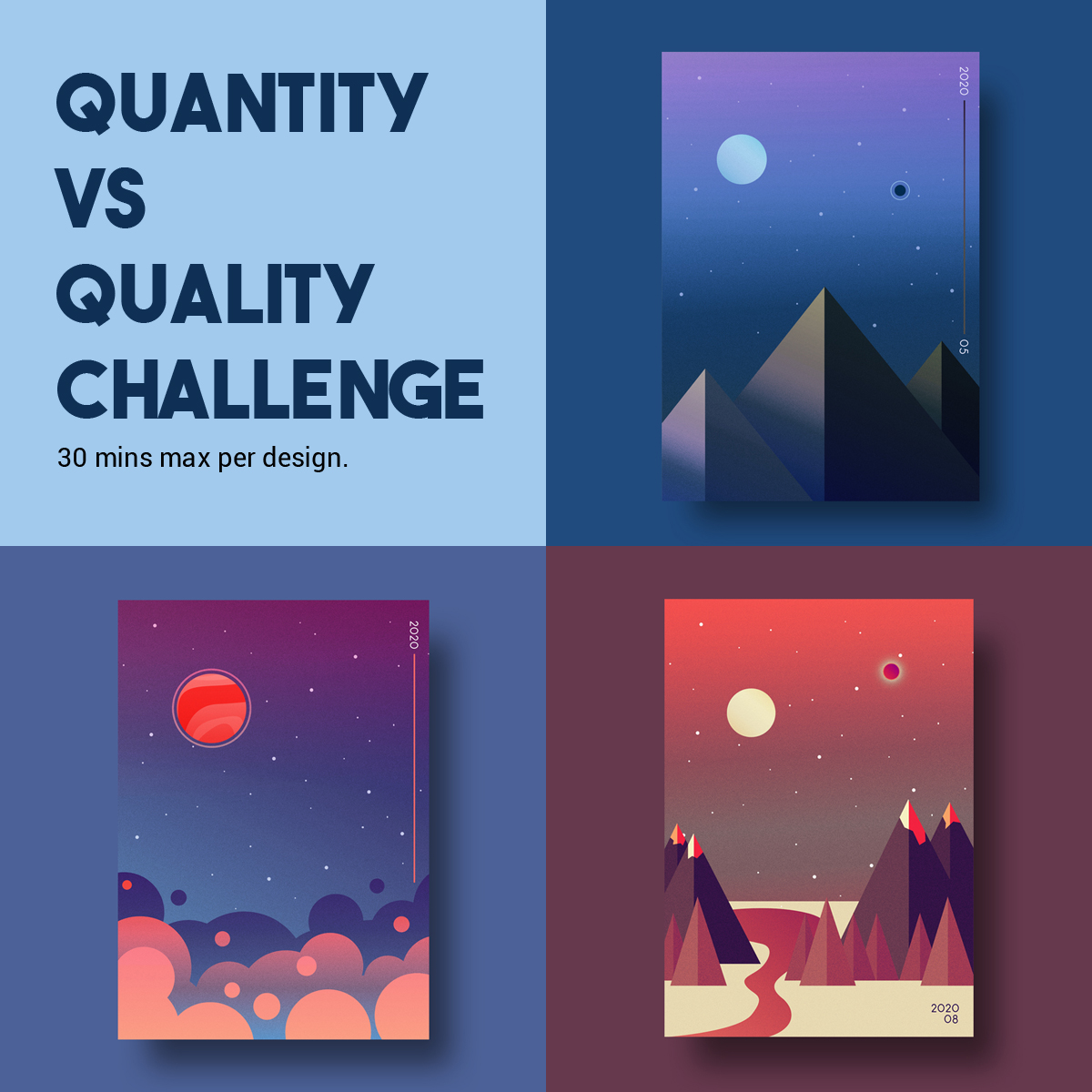
It was only when I had already completed three posters that I started numbering them. I had decided that, even though I didn’t need them to start my day off anymore, I was going to do a set of ten before the end of the month. This decision happened after watching a video on The Futur youtube channel “Perfectionism is a Trap – Quantity over Quality”. If you are working in a creative field, I highly recommend watching it.


The video discusses the fact that just pushing yourself to output more content will force the quality to go up over time or, as Chris says in the video, “You iterate faster by making more”. It also allows you to put work out there that you do not deem to be your best work, which is something that we tend to avoid doing in general. However, as Chris stated, on social media it is up to the audience to decide what’s “good”. Just that alone can give you great and interesting feedback on your work from your online audience. I really wanted to challenge myself to improve my design process and, after watching this video, setting myself the challenge of posting ten finished posters to social media before the end of the month seemed like the perfect way to do it. It would also force me to put work out there regardless of whether I felt it was “good enough” or not and break past the
The Technical Stuff and Why I Chose Photoshop
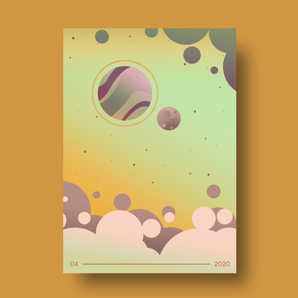
I could have gone with either Illustrator or Photoshop for this challenge but I’m honestly just a lot faster in Photoshop. Since I was only giving myself half an hour to make them it was an instinctual decision. I also had a plan of action when it came to keeping the posters looking like a set and not just a bunch of random illustrations. I specialize in UI design and, for me, the core concept of good UI is to reuse as much of the design elements as I can. In Photoshop I could create a smart object that had the grainy texture I’d created with a filter already applied. Each poster was then made inside the smart object so they would always have the same uniform texture.


As the project evolved, I decided to start sharing some of the processes behind the designs. One of the things I started sharing regularly was the way I do colour options for projects. This technique is something I have always done on my own projects because I like to see how different colour combinations can change the dynamic of a design. How I do this is by creating a gradient map and using the various blend modes to create new colour options for the design. I always try to create four totally different colour palettes to choose from if possible. Often times the design that I consider to be the final version is a result of this process rather than the first colour palette I created the design with.
What Did I Learn From Doing All This?
My process for making the posters definitely got faster and faster over time. I would start each design by placing the focal point first (usually it was the moon or a planet) and then balancing all the other elements around that. Next would be choosing the colour of the sky which would then dictate the colours of the other elements. I learned to make my design choices faster and iterate off of the previous design’s elements which was the point of the project. Some of the designs toward the end of the project were put together in just ten minutes before I put them through my gradient map process. I really enjoyed that it left me with more time to focus on the colour palette which is my favourite part. I think documenting the process was just as interesting as making the designs, both for myself and the audience that was seeing the project online. I want to push this further with the next round of designs.
For February I will be designing album covers. Again, I’m setting myself a minimum of ten designs but I think setting a time limit might be less important this time since I would like for these to be unique designs rather than part of a set. I want to continue focusing on iterating on my previous work but not continue on the style in the same way as I did with the posters.